All Work
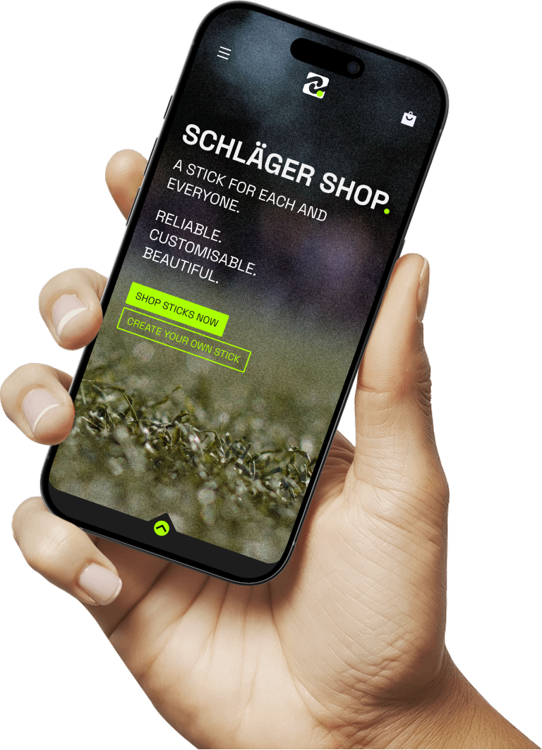
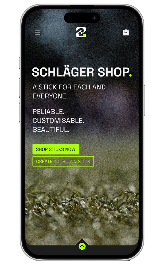
SCHLÄGERSHOP
Your Style. Your Stick.
-
-
-
-
-
-
-
-
-
-
-
-
-
-
-
-
-
-
-
-
-
-
-
-
-
-
-
-
-
-
-
-
-
-
-
-
-
-
-
-
-
-
-
-
-
-
-
-
-
-
-
-
-
-
-
-
-
-
-
-
-
-
-
-
-
-
-
-
-
-
-
-
-
-
-
-
-
-
-
-
-
-
-
-
-
-
-
-
-
-
-
-
-
-
-
-
-
-
-
-
-
-
-
-
-
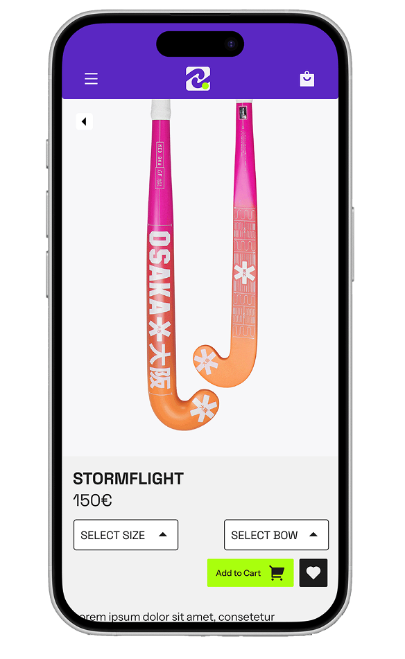
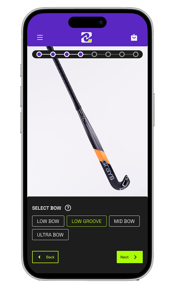
Design your own field hockey stick — personalized to your skills, style, and look. Choose materials, shape, weight, and create a stick that plays the way you do.
Prototyping
E-Commerce
UI Design
UX Design
App
Strategy
Research